Melbourne Earthquake!!!
This still needs a lot of work, the tweet locations are skewed north-west, and the animation could be nicer. But I'm sick of working on it (for now).
Basically, this is an animation of all the tweets from the Melbourne Earthquake. It's something like 100x faster than normal speed. I should probably have it closer to real-time at the start of the Earthquake.
Lots of improvements to be made, but I'm tired now.
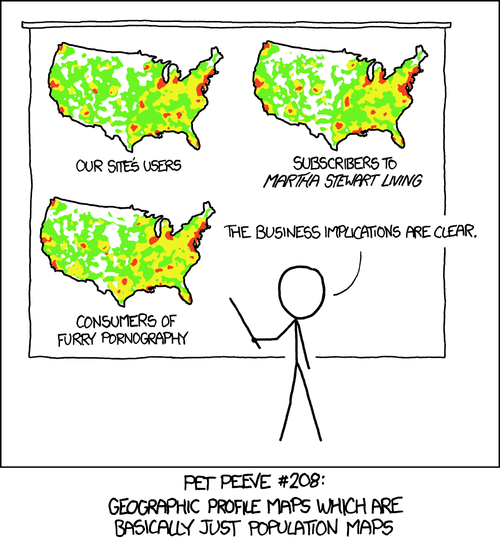
Graphing tweets basically only shows a population map, and doesn't show how strong the earthquake was in any given area. The earlier tweets might show the speed at which the earthquake spread, assuming that people are roughly just as fast with their phones no matter where they live.

Source Code:
/js/earthquake.js